Every business has a logo. Well, they should. Some companies exist without a logo, but typically they are brand new, or their business is just part-time or word of mouth, and so for those reasons, they do not prioritize a logo design for their business. That is a big mistake. A logo is not just a pretty design on paper or your screen.
Your logo helps communicate who your business is and what your company does without you standing there to explain it to people. Your logo is an extension of your business-the face of your brand. Think of your logo design as your “spokesperson.” So now that we have established that your logo has a job to do, it’s time to get down to business and break down what a logo is and how to create one for your business. Read on to learn how to design a logo.
Types of logo design
First, it is essential to understand the different logo categories. There are many different ways you can design a logo. Let’s explore those options below.
-
Typography logo
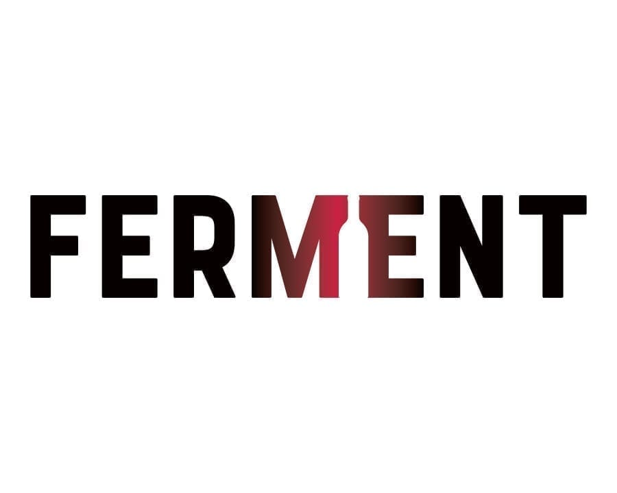
This is one of the simplest ways to design a logo. A typography logo is a font ONLY. No images, design elements, none of that. Just font. There is nothing wrong with this type of logo design. In fact, it is quite common. Think about some of the biggest and most recognizable brands out there that are simply a “font.” Coca Cola, JC Penny, FedEx, and Google. All of these are just a font, but there is a little more to them than that. Let’s explore a few of those:
- Coca-Cola: You may be interested to know the Coca-Cola logo has been around since 1886. Wow! This logo is exciting because it was drawn by hand using Spencerian script-a popular writing style. It has had some slight tweaks over the years, but as a whole, this logo has not changed at all and is engraved into the minds of people all around the world.
- FedEx: At first glance, you may think this logo is just a generic font typed out in purple and orange. Oh, how you are wrong. Have you ever noticed the tricky optical illusion that those crafty designers put into the logo? Look between the “E” and “x.” What do you see? An arrow? That’s right! Those intelligent designers saw the natural negative space between those two letterforms creates an indicator moving forward. Brilliant!
-
Initials logo
Designing a logo using the company name’s initials is a great way to create a logo that has an “icon” or a “mark” without creating a visual image, abstract shape, or element. You may recognize a few brands that do this are IBM (International Business Machines) and P&G (Proctor & Gamble). Essentially what happens here is that the initials become the “icon.”
If you are going to go this route, you want to make sure that you are doing something interesting with the letters, whether that be an effect that is done on the notes, custom font, or possibly put those letters in some shape or enclosure. For example, look at IBM, which has horizontal lines that run through each of the letters in an evenly distributed fashion. What is interesting about this logo is that it was designed this way because photocopiers of that time were unable to render large blocks of color correctly.
-
Seals and Crests
A logo of this type is commonly in a circle, oval, or shield element. Think Starbucks (where the name arches on the top and the bottom of the woman in the center), Chipotle (the version where it’s circular), or Harley Davidson (this is an example of a shield).
These logos have a classic, timeless look, making them the right choice for schools or government agencies (like the United States Navy). A drawback to this type of logo is that they tend not to be as readable when they are shrunk down small.In the case of a website, for example, when you want slim navigation, a logo seal demands to take up more vertical space than you would typically use so that you can read the business name.
It is not uncommon to have your primary logo be in the seal and have a horizontal lockup for situations where you don’t have a lot of vertical height to work with. Chipotle is an excellent example of this. They have a logo in a circle and a logo that has the icon to the left of the business name.
-
Logo Icon or Pictorial
This is the type of logo design we are all familiar with. The icon is a graphically represented object, person, animal, or combination of those. Think of the Nike Swoosh, Apple’s apple, or the shell logo. These are all memorable icons that are burned into our brains.
It can be tricky to think of a good logo design that represents a business accurately. You must carefully consider the color palette, the font used, and the type of icon drawing or illustration you will use.Start by thinking about what should that icon represent? If you are a cake baker in Seattle, as an example, then maybe your icon is a cake with the space needle as a topper. If you are a local business, it can be very beneficial for your logo icon to have a local feel.
Today, many businesses are much more aware of working with other local businesses rather than outsourcing to other countries or outside states. -
Abstract Logo Marks
This logo does not represent a particular object, person, place, or thing. Instead, it is an abstract composition of color and shapes to create a unique icon. There are many examples of this. Let’s look at the Xerox logo. It is an “X” that is wrapping a 3D globe shape to create a one-of-a-kind icon that has worked well for the company. A strong logo boosts customer confidence and respect for a brand, making it feel like the authority in its expertise area. This type of logo takes a lot of creativity and expertise from its designer because you create something new that does not currently exist.
Now that we have determined the types of logos that exist let’s continue our discussion on designing a good logo.
Check out the competition.
This step is important for many reasons. The top priority for your logo design should be to stand out from the competition and be memorable. Start by gathering all of the logos from your competition and putting them into one document.
![]()
Do you see any trends? For example, medical logos tend to use the color blue frequently. So if you are a new medical practice in your area, a good strategy would be to use a different color from the rest so that you stand out. Orange is the complement to blue, as well as being very vibrant and warm. It would be prudent to explore orange as a contender for your primary color palette for those reasons.
The font used in your competition’s logos can also be another consideration. If all of them are using a sans serif font, consider using a font that is a script or serif.
Choose your fonts wisely.
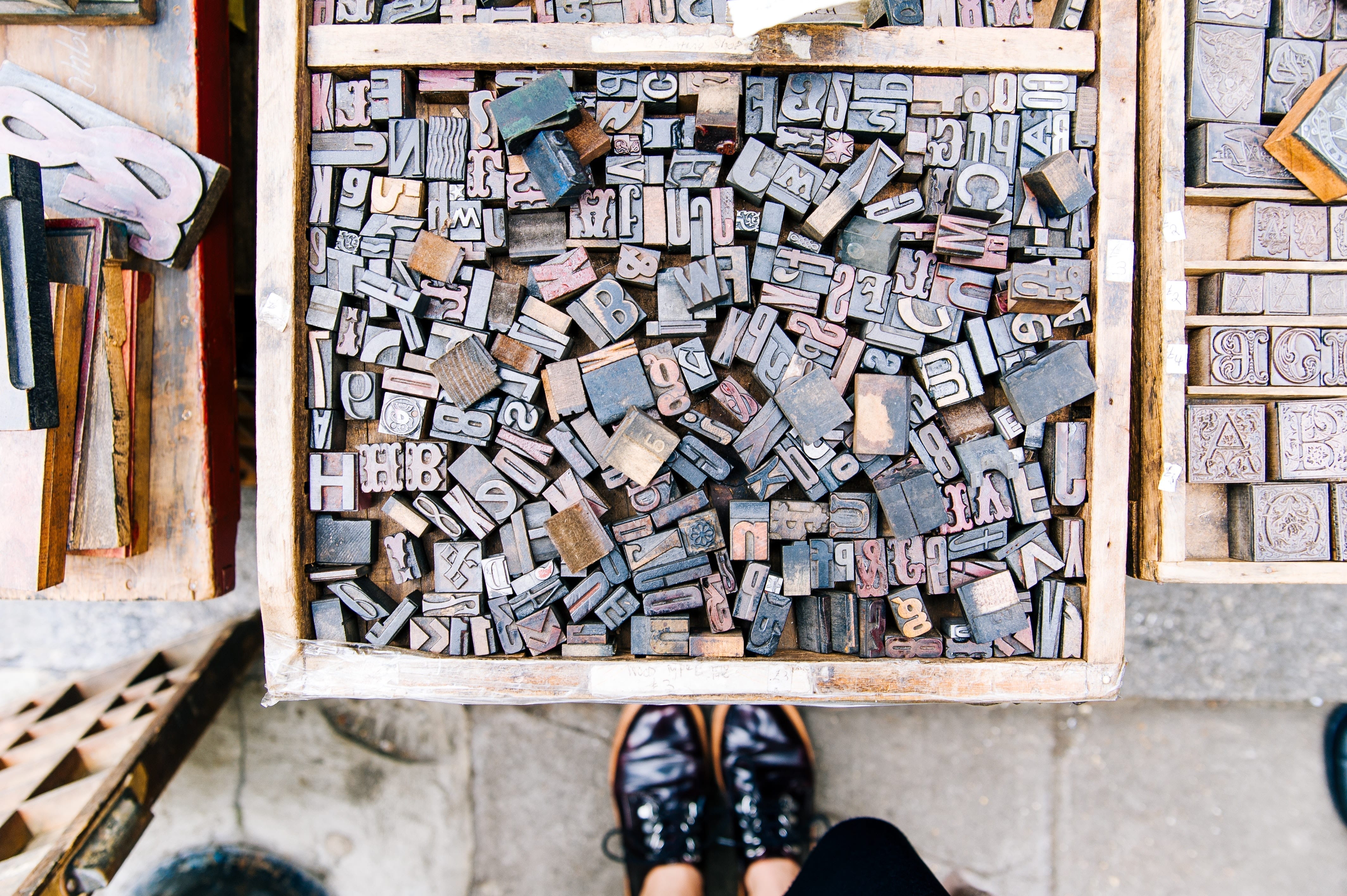 The typography that you choose also reflects the brand and personality of your business. There is an infinite number of fonts out there and available for your use, but they are broken down into a few categories:
-
Sans Serif Font
This type of font has very even strokes and is streamlined. It lacks serifs, ornamental tops, and bottoms on letters you would see on a serif font, like Times New Roman. The word “sans” is a French term that means “without.” Sans serif fonts are considered to be modern and highly legible. They are a favorite pick for designers and savvy business owners.
-
Serif
A serif font is a classic, traditional typeface. Its most recognizable feature is the ornamental pedestals that you will see on the letterforms’ top and bottom. The serif font is derived from calligraphy, a once prevalent form of writing.
-
Handwritten
This type of font is exactly what the name implies. It looks like someone wrote it down. There is no specific rule for this type of font, other than the fact that it is not uniform, nor do the letters connect like it would in a script font. Rather, it is the type of font you may recognize if someone wrote a letter or wrote a note. This is a favorite font style among organic or people-based brands. It makes the logo feel more “human.”
-
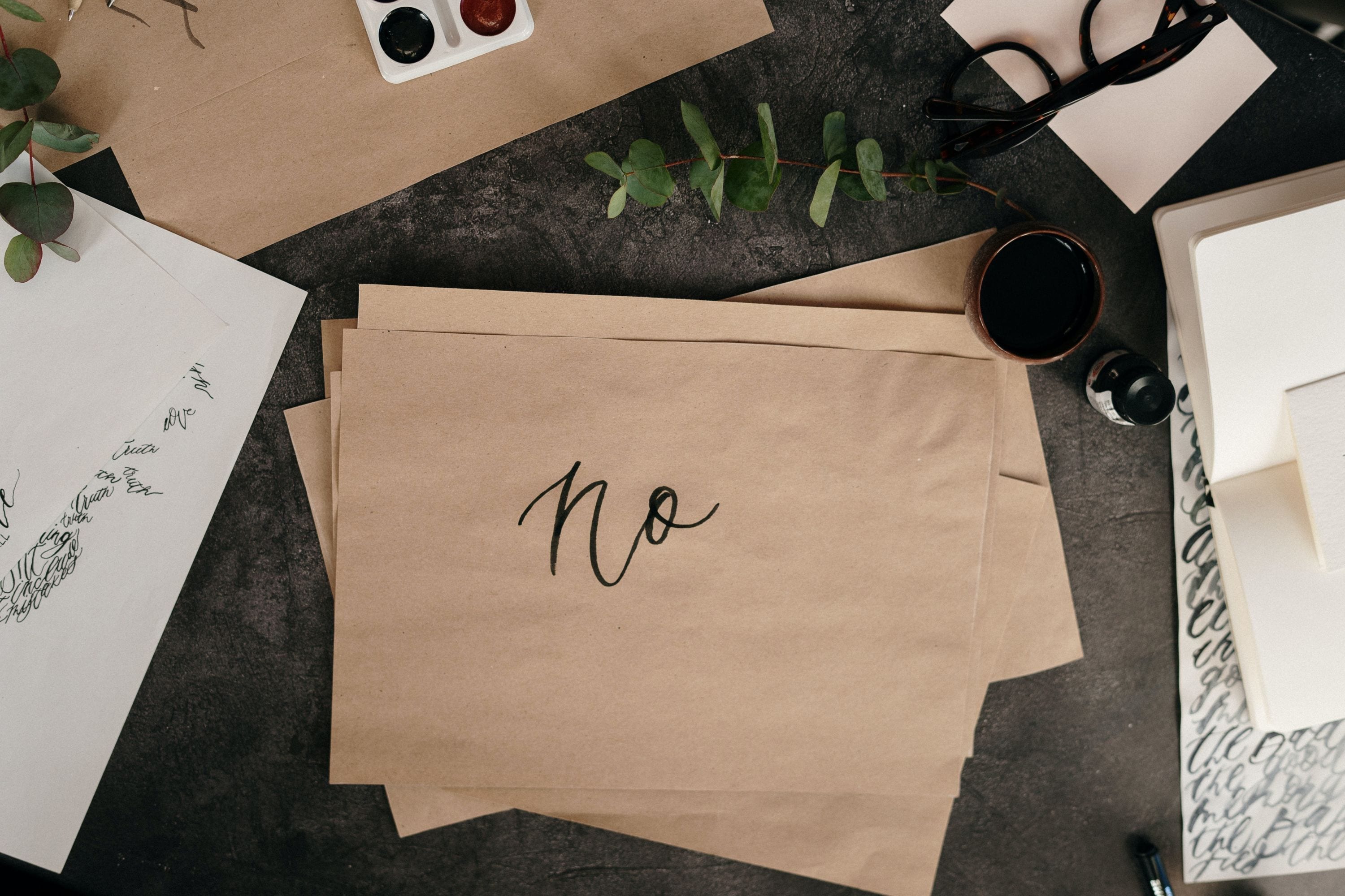
Script
Script fonts are derived from classic calligraphy and handwritten signage. This spans a wide range of styles and types, from the classic “old world” formal styles to modern, casual script styles. Using a script font can bring an air of elegance and sophistication to your design piece. A casual script can bring energy and life to the design or make it feel handmade and one of a kind.
-
Funky
A funky font is just that. It’s weird, quirky, and different. They are typically very uneven in the placement and thickness of the letters. This is a font that is reserved for a special type of project. It is not for just any brand or design; it works best for a design that requires many flairs.
-
Typewriter
Typewriter font is exactly what it says it is. It looks like it is from a typewriter! These types of fonts give designs a retro, old-school feel.
Communicate with your logo designer
![]() This is perhaps the most important thing you can learn from this article. TALK to your designer. We do not mind readers, but we definitely try our best! The more information you provide to us on your likes and dislikes, the more successful your project will be with them.
This is perhaps the most important thing you can learn from this article. TALK to your designer. We do not mind readers, but we definitely try our best! The more information you provide to us on your likes and dislikes, the more successful your project will be with them.
When I start a logo design project, I have my clients fill out a logo design worksheet. It is a fillable PDF that asks a series of questions to help narrow the logo design project’s scope. I ask questions about the color, logo style, font style, what your logo means, and more. I also send my clients on a mission to find four to five logos they like and four to five logos they do not like. They do not have to be logos that are related to the kind of business you have.
In this exercise, I am simply looking for your sense of style or taste. What kind of logos you feel are successful? Typically, there is a trend that I can see, which I can be inspired from to create your own batch of unique logos to choose from.
Logo Design Contests
In your search for a logo designer, you probably ran across some logo maker sites or logo competition sites. It’s possible that you could succeed with these, but it’s a higher chance that you will not. These websites are a “race to the bottom.” Who can do it cheaper and faster? That is the ultimate goal of these sites. I think it goes without saying that you get what you pay for.
Ask yourself this: do you want a designer that takes time, care, and consideration to design a logo for your business that reflects your brand? Or are you happy with a logo that was put together in about 5 minutes with stock art? While it may be tempting, I was hoping you could resist the urge to go this route and instead find a Graphic Designer like myself who will provide you with creativity and customer service.
Don’t do this when designing your logo.
Many pitfalls await you during your logo design process. One of the most common errors is being cliché with your design. If you have a medical practice, try to avoid obvious iconographies such as the medical cross, serpent, staff, or stethoscope. If you are a larger corporation, use colors other than blue because that is the most common color used in big business.
Try not to overcomplicate the logo. “Over designing” a logo is a real thing. Some people try to make the logo work too hard. They are convinced that as soon as a person sees a logo, they should immediately know everything that business stands for. That is not the case.
A logo is a representative of your brand, but it is not the ONLY interaction someone will have with your brand. When they view your logo for the first time, it will likely be on a website, business card, or brochure where there will be content that explains your brand and offerings. Simple is better! Keep it easy to understand and reproduce.
Don’t use fonts that come with your computer or are free from a font website. I think we all know the jokes surrounding papyrus and comic sans. Both of these fonts are widely overused to the point that articles and memes are surrounding them, and they’re overused. You do not want to use a font on every other logo or show up multiple times a day.
Find a font that really speaks to you and your brand. A great font resource to check out is creativemarket.com and myfonts.com. Both of these websites have a wonderful collection of fonts to choose from. The creative market gives fonts away for free every Monday! Sign up for their mailing list to get the notifications.
What is a good logo?
This is the question we have been getting to. What makes a good logo? A good logo is memorable. It sticks in people’s minds after the image is taken away. The logo also evokes feelings when you look at it. It can make you feel like that business is trendy, organic, modern, juvenile, or brave, just as a few examples. This emulates the brand and its mission or vision in a visual way. A good logo is unique, and distinctive-it stands out from the competition. Most importantly, a good logo is timeless. It can stand the test of time and continue to be relevant throughout the years regardless of the latest fads or design trends.
Now it’s time to test your new logo out! See out it looks on letterhead, business cards, brochures, and a Phoenix website design, of course! Start to build your branding toolbox with complementary fonts, colors, patterns, and photography. Take your branding to the next level by creating some brand guidelines to live by to ensure consistency of your marketing collateral and communications. Welcome to your new logo, and good luck!